

/ Celine’s Beauty Studio
Website design, branding, and social media approach for a small business owner in the beauty industry.

OverviewContext
An outline of the UX/UI redesign for the website and associated digital contents of Celine, a semi-permanent makeup artist with an established eight-year practice. The current website's navigation presented significant usability challenges, which made it difficult for users locate essential information, contributing to repetitive client inquiries and reduced online engagement. Additionally, the client wanted her online presence to reflect a more premium brand identity. This write up focuses on my design and branding efforts related to the website.
Impact
The site redesign, featuring streamlined navigation, enhanced visuals, and refined content, successfully elevated Celine's brand and embodied her vision. User testing confirmed the redesign's positive impact, demonstrating increased user trust, improved navigation efficiency, and a more engaging client experience. Participants easily located information, explored more of the site, and expressed a strong resonance with the elevated branding. Notably, the redesign resulted in significant improvements in user engagement, including longer time on site, increased page exploration, and a higher rate of desired conversions, garnering positive feedback from both Celine and user testing participants.
Platform Responsive website
Product Website redesign, Instagram posting guidelines
Client Celine’s Beauty Studio
Contributions branding / content strategy / design presenting / hi-fi mockups / information architecture / interaction design / responsive design / stakeholder interviews / user journey mapping / user personas / usability testing / visual design / web design / wireframing
Features + Highlights
Updated imagery, branding, and UI
Curated a cohesive visual identity featuring professional, neutral-toned imagery that directly reflects Celine's work, complemented by a refined UI emphasizing clean, natural aesthetics.

User centered content and navigation
Crafted user-centered content that addresses common client inquiries and designed an intuitive navigation system to streamline information access and enhance user flow.

Refined visual hierarchy and IA
Implemented a strategic visual hierarchy to guide user attention and restructured the information architecture of her website for intuitive navigation and efficient content discovery.

Mobile friendly design
Ensured a responsive design that optimizes user experiences from mobile devices. This synergizes with her user base’s primary traffic source and compliments her future social media efforts.

Style guidelines for social media
Social media guidelines retaining image treatment and logo placements maintain brand consistency across all platforms, ensuring a unified and professional online presence.
The ChallengeElevating the website and social media presence
Celine felt her digital platforms were not reflecting her ideal brand and underperforming as effective conversion and communication tools. Clients consistently struggled to find essential information and she noticed repetitive inquiries, indicating a need for a more intuitive and informative platform. The primary design challenge was to improve the site's usability and refine the branding to strengthen her online presence.
Approach + User EmpathyDiving into the current landscape
Basing my research on the client's existing audience profile, I conducted targeted surveys, interviews, and some usability tests on her existing website to better understand user needs and pain points. These efforts, combined with a website audit, provided key insights that directly shaped the redesign, to be more inclusive of an intuitive and user-friendly experience.

An overview of the original site's pages.Mind mapping the ideal client
Pulling together findings from surveys, interviews, and a site audit, I created a mind map of various insights and data that tied to the user. Grouping these attributes into a visual representation provided a valuable framework for the redesign’s goals.
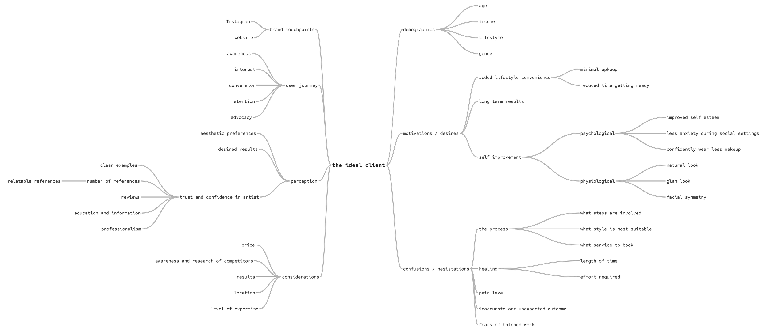
Connecting user attributes and associations into relationship groupings.User personas of our website users
With my gathered insights, I built two distinct user personas, 'The Unsculpted Brow' and 'The Returning Touch Up.' These personas represent primary users, shaped from Celine's target audience and serve as archetypes for the design’s decisions.
"The Unsculpted Brow"Individuals who are beginning to become more serious about or actively researching semi-permanent makeup services, seeking a skilled artist with a refined aesthetic and trustworthy reputation.
-
This client is motivated to learn more or book a PMU experience due to social media exposure or hearing the benefits of the service. They are browsing for a reputable and skilled artist.
-
Understanding the different services offered and what the procedure entails
Viewing high quality, visual proof of the artist's work
Determine pricing and booking availability
-
Difficulty finding clear information on services and pricing
Lack of confidence in the artist's skills due to poor website visuals
Confused about different techniques or the overall process
Overwhelmed with booking due to multiple service options
"The Returning Touch Up"Returning clients who have experienced Celine's services and are seeking a follow-up session after their initial healed timeframe or after a longer period of rest from a previous service.
-
This is a client who has (a) recently undergone their first procedure with Celine and wants to now book a touch up to complete their transformation process, or (b) has already experienced the positive benefits of Celine’s work and want to rebook for routine maintenance.
-
Wants to look for specific information related to their healing phase or next steps
Directly coming to the site to book their next return appointment
-
Lack of clear aftercare instructions and difficulty finding information related to maintaining their previous procedure
Difficulty finding the booking option for touch-ups or confused on how to elect for a touch-up rather than a new consultation
Two user personas of the website's primary user groups, new potential clients and existing clients returning to re-book.The user journey: from awareness to booking
This map provides an overview of the client's touchpoints, goals, actions, and emotional states at each stage of the journey during their interaction with Celine's brand, from initial awareness to post-appointment engagement. By mapping these elements, I can keep track of the client's overall experience, enabling me to identify areas where the website and digital content could be optimized to enhance user satisfaction and drive conversions.

A visual mapping of an ideal user's journey and contact experience with Celine's brand and services.Design RequirementsProposed solution
Enhance user engagement and client satisfaction by redesigning a website focused on intuitive navigation, refined visuals, and user-centered content. This would prioritize user goals, address frustrations, align with Celine's brand vision, and improve conversions. Provide UI and social media guidelines to ensure consistent brand perception.
-
Restructure the site’s overall flow to benefit the user’s goals and motivations
Update the site’s main navigation menu for an easier time accessing a user’s common interests
Create a responsive and mobile friendly website
-
Create a branding scheme that compliments and elevate’s the studio’s desired feel
Create a style guide that can be referenced to apply consistency within the UI
Update visuals to reflect the brand’s offerings and voice throughout website
Form guidelines for consistent branding, including image positioning and treatment on social media
-
Create consistency in similar page experiences to aid the user’s familiarity
Restructure site pages and group information so it is helpful for the user to discover and understand
Include new content that the users may want to know and that the business may want to express
-
Prioritize a mobile friendly website design to accommodate the majority of user traffic coming from social media
Make sure information and offerings are aligned and consistent on both platforms
Include access to social media (Instagram) for trust and familiarity and to promote the client’s main source of engagement
Design ProcessImagining users visiting the website
I created some user scenarios to keep the user’s perspective top of mind during my designing. Using this as a guide to highlight the difficulties they encountered to make sure that the website addressed their goals purposefully.
User Scenario 01Eunice isn't happy with her brow hair's sparsity. She heard that microblading could be a solution and is starting to search for local artists when she comes across Celine's social media posts.
Current scenario/01Eunice comes across Celine's social media posts and becomes interested based off of pictures of before and after results.
/03The linked page starts at Celine's studio policy and lists a lot of disqualifications which overwhelms her.
/01Eunice comes across Celine's social media posts and becomes interested based off of pictures of before and after results.
/03Eunice is able to navigate to and learn about services, pricing, the artist and her work, gaining confidence in Celine.
/02Unsure about her fit for microblading, she visits the linked website to learn about Celine's offerings, pricing and expertise.
/04After navigating to the home page, she realizes that there's not much information and abandons the site.
Ideal scenario/02Unsure about her fit for microblading, she visits the linked website to learn about Celine's offerings, pricing and expertise.
/04She sees an option for a free consultation and books that option, feeling confident and less anxious about her first steps.
User Scenario 02Lina lives an active lifestyle but appreciates a finished makeup look. She wants to continue her high sweat activities with little smudging or reapplying and is interested in make up tattoos. Lina is confident about getting brow tattoos and less so on lip services.
Current scenario/01Lina likes Celine’s brow work on her IG posts and wants to book. She notices that Celine also recently provides lip tattoos.
/03The site is primarily focused on brows and she can't find much information for lips except for images of Celine's IG posts.
/03Lina notices a special promotion for brows and lips and gets excited. She quickly navigates to learning about lip offerings.
/02She becomes interested in her lip services and enters the website to get information and learn if the service is right for her.
/04While booking a brow service, she notices a promotion package for brows and lips but decides to not take the risk.
Ideal scenario/01Lina likes Celine’s brow work on her IG posts and wants to book. She notices that Celine also recently provides lip tattoos.
/02She becomes interested in her lip services and enters the website to get information and learn if the service is right for her.
/04Deciding that getting both done by someone she likes during a promotion, is a great deal and books an appointment.
User Scenario 03Victoria just finished her first brow tattoo session with Celine. She's nervous about her healing journey and wants to feel prepared for any surprises by review healing instructions and expectations. She is aware of needing to book a touch up appointment in the future.
Current scenario/01Anxious about her brow’s outcome, she often tries to refer to Celine's verbal suggestions and the take home document.
/03She refers to her texts for the healing steps and her emotions are focused on her physical appearance returning to normal.
Ideal scenario/01Anxious about her brow’s outcome, she often visits and refers to the aftercare guide on Celine’s website.
/03With her healing under control, she is able to trust in Celine’s reassurances and she notes the last steps; book a touch up.
/02Victoria follows the paper's instructions until she misplaces it and often texts Celine for reassurance and confirmation.
/04After some weeks her brows are healed.She forgets when she needed to book her touch up and decides to ask Celine again.
/02During her healing, she is able to follow along with the guide and be aware of different stages, relieving her anxiety.
/04Happy with her new brows, she follows the website's window for booking. She's looking forward to her final round in the process.
Site Map Structure
I created a general user flow through the application in order to keep the user’s perspective top of mind during my designs. Since a lot of the panels are similar in visuals and structure, I used this as a guide to make sure that the screens progressed cohesively and were purposeful for the user’s goals.

The website's planned structure and content strategy.Wireframing
My early wireframes were low fidelity and geared towards layout and content placement. These wireframes went through a few rounds of iterations as they began to take shape. Later stages had more details filled in, like copy, to better visualize formatting.

original home page → first sketch → lofi iteration → hifi wireframeHere’s a variety of mobile screens in their high fidelity form with the final copy in place. Having these wireframes mimic the near end product helps with evaluating the flow more realistically and realizing any additional updates.

Wireframes of mobile screens in their high fidelity format.Full Home Page

Screens + Deliverables-
Home Pages in Desktop Format

-
Services & Pricing Pages in Desktop Format

-
Before Booking Pages in Desktop Format

-
Care Routines Pages in Desktop Format

-
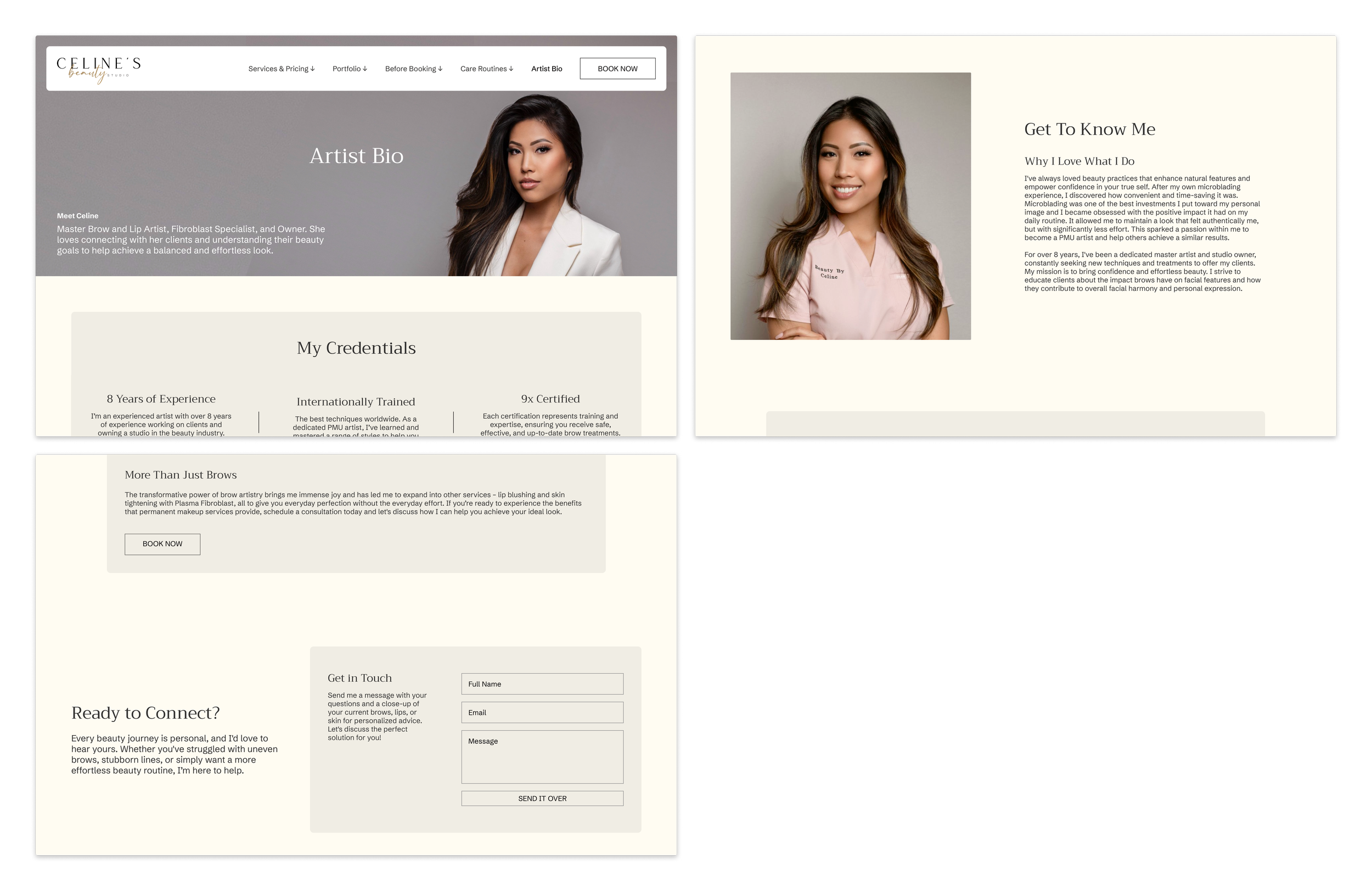
Artist Bio Pages in Desktop Format
-
Portfolio Pages in Desktop Format

-
Full View of Desktop Screens

-
Full View of Mobile Screens

-
Site Components

-
Style and Branding Guide

SummaryThis project was both a rewarding design experience and an exciting opportunity to help a female-led small business owner elevate her online presence. I wanted to enhance the user experience while balancing the practical needs of her business. This resulted in a design that provided easy content management by recycling similar or repeatable components and streamlining information access and booking, ultimately strengthening Celine's brand.
Some considerations I kept in mind with this redesign included:
designing in mind for two primary client types: new bookings and reoccurring clientele
the recognition that her business was primarily driven by social media, and a majority of users viewed with a mobile device, emphasizing the need to prioritize a mobile friendly platform
integrating new assets with current branding (we kept her logo in place to maintain consistency with her printed handouts)
Future opportunities to expand upon this work include reworking the e-commerce aspect, her booking and scheduling portal, which would further benefit the client experience and drive conversions for the business.